Debug: A Display Font That Commands Attention in Digital Layouts
I was refreshing the browser, watching the hero section of the landing page load. The client wanted impact—a bold statement for their new online coaching platform. The placeholder text, set in a generic sans-serif, felt safe. Too safe. I pasted their headline into my design file and changed the font to Debug. Immediately, the room of the layout changed. The all-caps letterforms, clean yet assertive, locked into place. It wasn’t just loud; it was clear. It didn’t shout; it declared. In that moment, the theoretical search for a “display font” became a very practical, very satisfying solution.
The Digital Personality of a Caps-Only Font
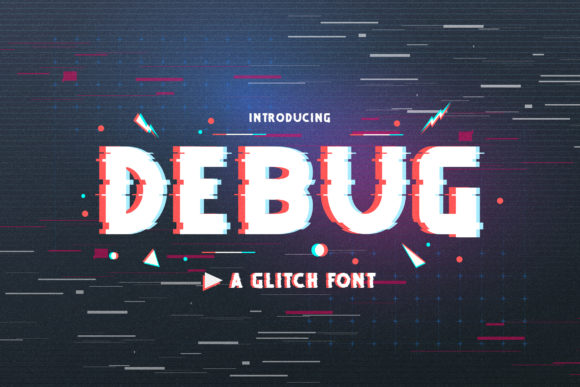
Debug occupies a specific and powerful niche. As an all-caps display font, it forgoes the lowercase for uniform, capital-letter height. This creates a solid, blocky texture that is incredibly effective for establishing visual hierarchy. Its personality is confident and modern, with a touch of technical precision hinted at in its name. In digital spaces, where attention is fragmented, this clarity is a superpower. The letters are designed to be distinct from one another, which aids in rapid scanning—a critical behavior on any webpage, from a SaaS product features list to an e-commerce category banner.
The mood it sets is one of stability and directness. For a brand that wants to feel reliable, cutting-edge, or boldly straightforward, Debug provides the typographic voice. Its multilingual support means this confidence isn’t limited to English headlines, making it a viable choice for global campaigns or localized landing pages.
Where Debug Shines in a Real Website Project
In my coaching platform project, I started deploying Debug strategically. The primary use was, unsurprisingly, the hero headline. At a large viewport size, it anchored the entire first fold. But the real test came in responsive behavior. I shrunk the browser window, watching the headline reflow on tablet and mobile views. Here, Debug’s simplicity paid off. Even at smaller sizes, the all-caps remained legible because of the open counters and consistent letter spacing, avoiding the blobby, merged-together look some decorative fonts suffer from on small screens.
Beyond the hero, I found perfect roles for it:
- Section Headers: It cleanly separated different parts of the sales page (About, Methodology, Testimonials, Pricing).
- Call-to-Action Buttons: Short, imperative phrases like “START FREE TRIAL” or “BOOK A CALL” gained undeniable weight and clickability.
- Numerical Data: Showing pricing tiers, the number of course modules, or client statistics—Debug’s numbers are as robust as its letters, making figures feel significant.
- Navigation Accents: While not for full menu items (readability in long lists can suffer), it worked perfectly for a small “NEW” badge next to a program link.
I’d caution against using Debug for body copy or long paragraphs. Its role is decorative and hierarchical. For a boutique online store, imagine it on product collection banners or limited-time offer overlays. For a portfolio, it could powerfully state your name or your “Services” headline. For a campaign landing page, it makes the core offer impossible to miss.
Readability and Background Considerations
Working with a strong display font like Debug requires some layout foresight. On image backgrounds, ensure sufficient contrast. A drop shadow or a subtle semi-transparent overlay behind the text can safeguard readability if the image is busy. I always test on both light and dark themes. Debug’s solid forms hold up beautifully on dark backgrounds, often feeling even more premium and intentional.
For mobile, pay extra attention to the font size. What looks commanding at 80px on desktop can become overpowering at 40px on mobile. Slight size reductions and adjusted letter-spacing (a bit looser) can maintain legibility and aesthetic balance. Also, verify that any animation or hover effects (like color shifts on buttons) don’t reduce the contrast ratio below accessible standards.
The Art of Pairing Debug for a Polished Web Identity
A display font alone does not make a typographic system. Debug’s strong character demands a calm, supportive partner for body text. In my project, I paired it with a simple, highly readable sans-serif for all paragraphs, lists, and form labels. This classic combination—bold display font with neutral sans-serif—creates a clear visual hierarchy that guides the user’s eye effortlessly.
Other effective pairings could include:
- A contemporary serif font for an editorial or more luxurious digital brand identity (think a high-end goods store or a writer’s portfolio).
- A friendly, rounded sans-serif if the goal is to soften Debug’s technical edge for a more approachable tech or lifestyle brand.
The key is to let Debug be the star for headlines and accents, and choose a body font that recedes gracefully, prioritizing reading comfort over personality.
Practical Steps Before You Commit to the Font
Falling in love with a font in a mockup is one thing; implementing it successfully is another. Before embedding Debug into a live website or client project, run through this checklist:
- Webfont Format & Performance: Confirm it’s available as a webfont (typically WOFF2/WOFF formats) and check the file size. A well-optimized display font shouldn’t bloat your site’s loading time.
- Styles & Weights: Does it come in only one weight, or are there variations (Light, Regular, Bold)? My use case needed just one, but for more complex brand systems, multiple weights offer flexibility.
- Licensing: This is crucial. Ensure the license covers commercial use on websites, and if you’re building templates or digital products for sale, that your intended use is permitted. Never assume a “free for personal use” font is okay for a client’s online store.
- Technical Testing: Render it on different browsers and operating systems. Sometimes, a font can have subtle rendering differences in Firefox versus Chrome. Check for any unexpected spacing or aliasing issues.
Choosing Debug, or any display font, is a design decision with real impact on user perception. It’s the difference between a website that simply functions and one that communicates a confident brand from the very first glance. In my project, it transformed a headline from mere words into a visual entry point, setting a tone of clarity and purpose that carried through the entire user journey. That’s the power of intentional typography in digital design.